- Area: 196 m²
- Year: 2018
-
Photographs:David Schreyer
-
Manufacturers: AutoDesk, GIRA, Wienerberger, Adobe, Monier, Prolicht, SLV, Trimble, Villeroy & Boch

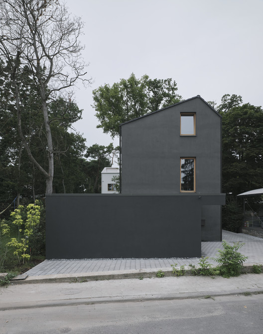
Text description provided by the architects. The “Black House” is part of an architectural ensemble of two residential buildings, located in a popular suburban uptown district in the city of Mainz. The admissible building density and the sloped roof shape were building requirements on the plot. The slim layout of the house enables a pleasant and generous use of the garden and totally respects the existing vegetation with its impressive old oaks and pine-trees.


The ground floor with an increased ceiling height offers a generous space for cooking, eating and quality time living - clearly separated from the buffer zone with technical, sanitary and storage space. The enormous glazing with sliding door unites the living space and the garden terrace. A free-standing box creates a comfortable entrance area with a wardrobe at the front end of the house. Additionally it contains elements of the kitchen and hides a spacious storage room inside. Due to the small available ground area and the desired three individual rooms for the children the upper floor reveals a higher density. Maximum utilisation of space is realized by using hidden sliding doors: the corridor surprisingly becomes part of the bathroom for the children, in addition a separate unit for the parents is generated. Extra loft-beds under the roof allow more space for playing.

The asymmetrical position of the ridge reflects the stringent floor plan with an end-to-end dividing wall. The architects decide to cover the roof with dark roofing tiles and blend in the colour of the facade to gain the monolithic appearance of the house. Load bearing walls are constructed with sustainable and energy-efficient insulating bricks. The crafted windows are made of natural larch wood. Cost-effectiveness and the desired monolithic appearance are secured by individualizing and enhancing standard construction details. The impression of a united architectural ensemble is paradoxically achieved by using opposite colours for the two houses - furthermore by similar construction details. The old oak-trees between the two buildings become the heart of the eye-catching composition.


